Docuplayer
Empowering Lawyers and Clients: UX for the Non-Tech-Savvy
Role
Senior Product Designer
Deliverables
User Interview, Wireframes, Interactive Prototypes, Hi-Fi Designs, Branding
Activities
I played a central role in designing DocuPlayer. This involved in-depth user research to understand lawyers' challenges in explaining legal concepts. I collaborated closely with the development team and Founder to create wireframes, prototypes, and high-fidelity designs, incorporating user feedback for an optimal experience. I also crafted the branding and style guide for a cohesive visual identity.
Overview
DocuPlayer addresses the longstanding challenge lawyers encounter when trying to convey legal information to their clients in an understandable manner. By allowing lawyers to add screen share recording, audio explanations to documents and messages exchange, this platform transforms complex legal documents into easily comprehensible resources.
Problem
Lawyers often struggle to effectively communicate legal concepts and procedures to their clients, especially when dealing with clients who may not be tech-savvy. Which demands several rounds of phone calls and emails leading to misunderstandings and time-consuming.
Solution
DocuPlayer offers an innovative, user-friendly solution to legal communication challenges. We simplified the process of recording screen with a "click and go" approach, intuitive video storage organization, messages and clear navigation. Our solution enhances client comprehension with descriptive headers and an attractive, friendly design. We also prioritize security through confidentiality measures and password protection for shared documents, ensuring a seamless and secure experience.
Research
Due to time constraints, I collaborated with the founder, a lawyer well-versed in apps, to define some assumptions, and after I validated them with a user. Our user persona primarily consisted of non-tech-savvy individuals, typically aged 50+. We recognized that designing for this audience presented unique challenges.
Our research approach encompassed interviews and observations.
Non-Intuitive Interfaces
Users in this demographic frequently encountered challenges with common digital elements, such as "load more" buttons and menus. For instance, they often struggled to discern the remaining amount of content.
Pain points
Auto-saved forms didn't resonate well with these users. They found it confusing when information was automatically saved without a clear indication. To understand that their data was saved, they expected a manual "Save" button.
Descriptive Headers
Users relied heavily on descriptive headers to understand content and navigation. Clear and informative headers were essential for them to grasp the context of a page or section.
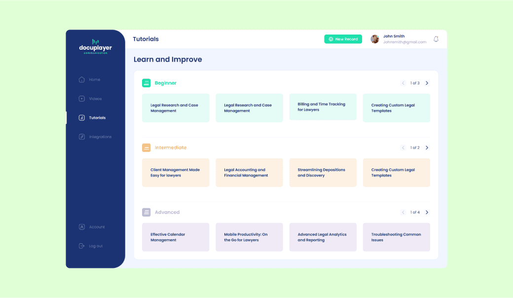
Step-by-Step Tutorials
Our research demonstrated recurring questions and concerns regarding the onboarding process. To address this, we have developed a dedicated page featuring instructional videos organized by tiers of expertise within our platform.
User main Flow
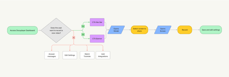
As a Lawyer, I want to record a video sharing my screen and explaining a contract to a client so that I can reduce the back and forth with them and optimize my time.
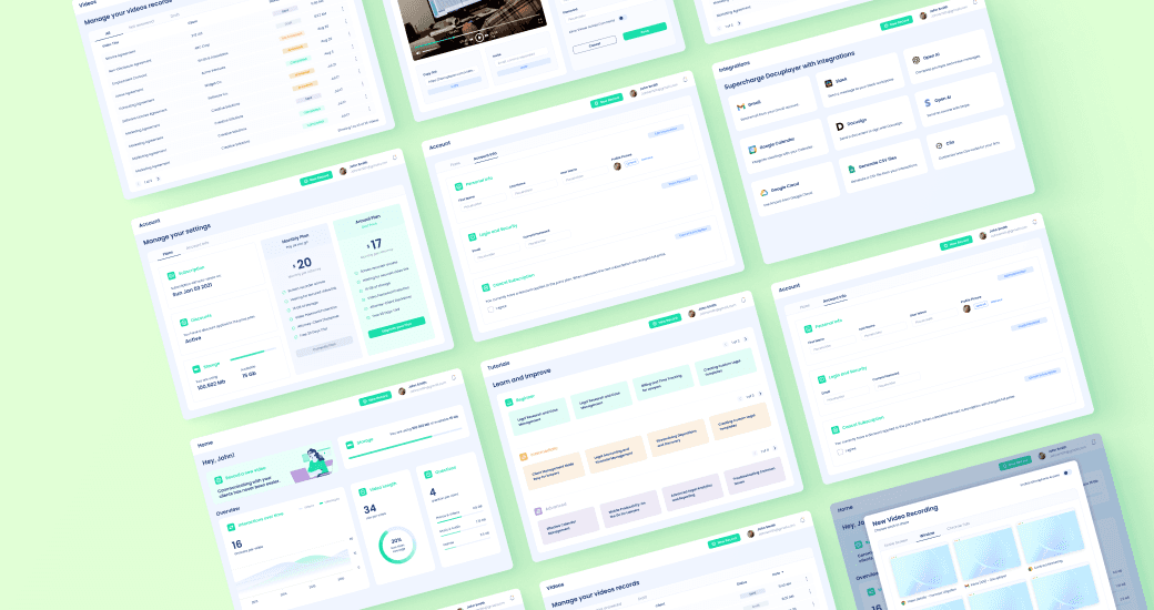
High Fidelity designs
In the development of DocuPlayer, I leveraged meticulous branding and visual guidelines to create high-fidelity designs that adhere to essential user interface design best practices. I focused on a consistent visual language, combining color schemes, typography, and iconography while maintaining brand identity. The interface was optimized for easy comprehension, with clear calls to action and intuitive navigation following responsive design principles.
Optimizing User Experience: Development and Enhancements to the dashboard
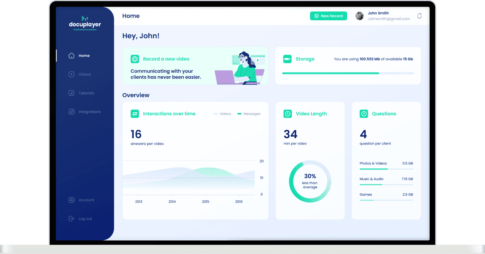
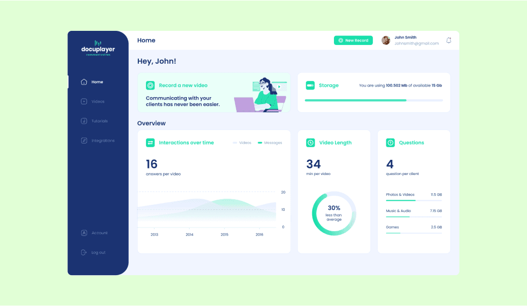
Home dashboard in DocuPlayer was conceived as a centralized hub for displaying crucial metrics, providing users with valuable insights into the time spent and demands of each client. However, during a demo presentation, we observed a degree of uncertainty among users regarding where to initiate video recording. To address this issue we introduced a user-friendly card prominently displayed alongside an always-visible button in the top bar.
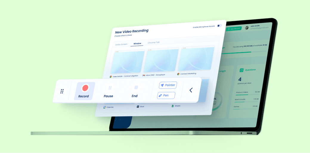
Recording a video
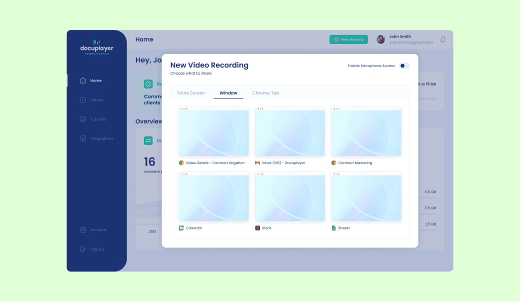
Recording a video is as straightforward as it gets. Users simply click the "Record" button, opening a modal (pop-up) where they can choose which screen to share from options like "Entire screen," "Window," and "Chrome tab." Each option displays a thumbnail of the selected screen, ensuring clarity in their choice.
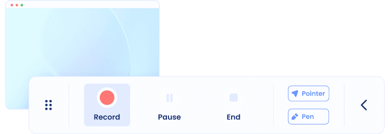
Once the screen is selected, it opens with a floating menu that offers recording, pause, and end options. For added versatility, users can opt to make their mouse pointer visible and utilize a pen tool for drawing during the recording. To keep the interface clean, the floating record menu can be collapsed.
Refining Video Page through Demo Feedback
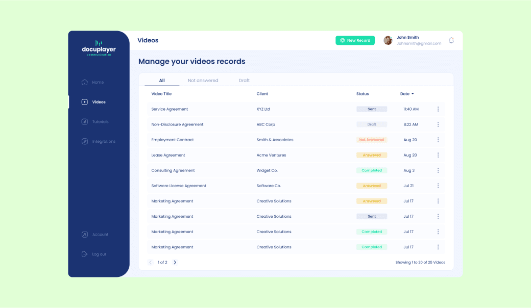
The initial design for the Videos Page featured two sub-pages: "New Videos" and "Sent Videos." To ensure the most this experience, I organized and conducted a dedicated demo session focused on gathering feedback regarding the information architecture. During this session, users expressed uncertainty about the term "New Videos" and encountered difficulties in distinguishing when a question remained unanswered.
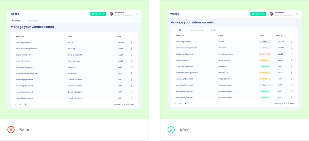
To address these concerns, I swiftly organized a card sorting exercise using FigJam, encompassing all possible video statuses. The resulting solution streamlined the Videos Page into a single page format, with columns representing different statuses, while the two highest-priority statuses evolved into intuitive tabs.
Video Settings and Messages
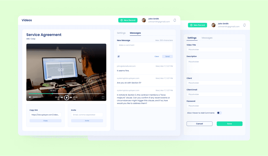
When users click on a video, they are directly taken to the Messages tab, ensuring quick access to the related discussions. Additionally, users have the flexibility to navigate to the Settings tab, where they can edit or add information to the video as needed. To facilitate collaboration and sharing, there are options to copy the video's link and invite other users to access and provide comments on the video.
Step-by-Step Tutorials
The Tutorials section offers a structured approach to onboarding and user engagement. I've broken down the onboarding process and the platform's usage routine into a series of sequential video tutorials. These tutorials are thoughtfully organized into tiers of expertise, ensuring that users can access guidance and information tailored to their specific needs and skill levels.
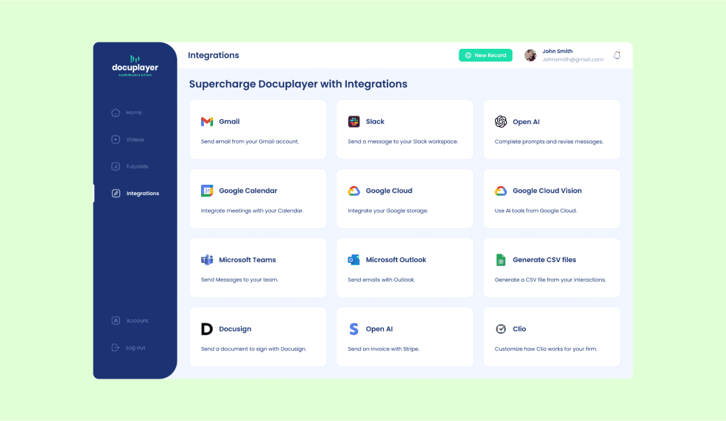
Integrations
In Integrations, users have the opportunity to enhance their experience by seamlessly connecting a selection of compatible apps.
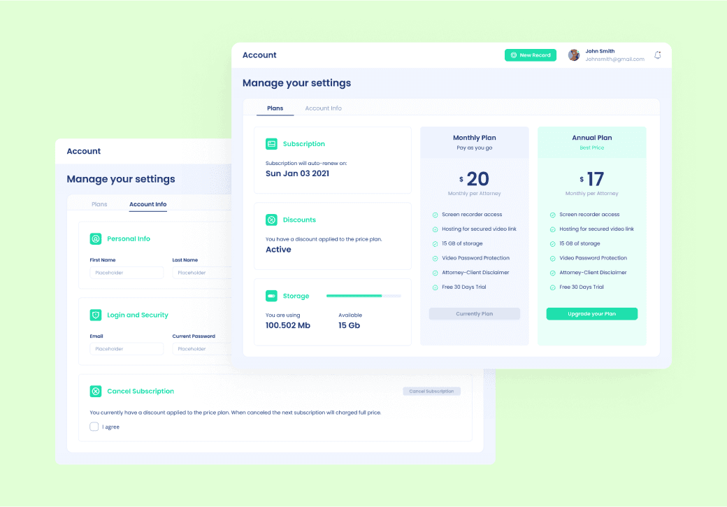
Simplified Account Management
The Account section serves as a centralized hub for all user-related information and settings. Within this section, users can access and manage their account settings, view their current subscription plan, explore upgrade options, monitor their storage usage, and even initiate subscription cancellation if needed.
Conclusion
In 3 months, we aimed to drastically enhance the user experience for a non-tech-savvy audience, simplifying complexity and improving usability. We dug deep into user needs, behaviors, and pain points to create an intuitive platform. Through iterative design and feedback, we centralized account management, streamlined video recording, and introduced tiered tutorials, redefining usability and making DocuPlayer engaging and accessible.